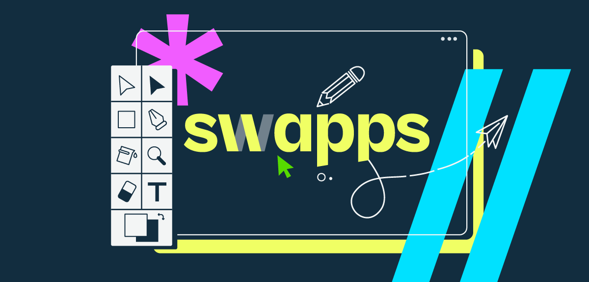
After a decade of serving companies and organizations around the world, we are thrilled to announce the launch of our new brand. This rebranding represents our evolution over the past ten years, showcasing our commitment to excellence and growth.
Our new brand image goes beyond just a logo or tagline; it embodies what we stand for – a unique combination of passion, innovation, and transparency. These core values are deeply embedded in every project we undertake, every solution we provide, and every relationship we build.

In the spirit of transformation and progress, we identify with the figure of the magician. Like magicians, we act as agents of change, using our expertise to alter reality. Our magic lies not in tricks and illusions, but in the practical application of creative energy. We harness this energy to create digital solutions that revolutionize businesses and help them thrive in an ever-changing world.
This rebranding signifies a significant milestone in our journey. While our appearance may have changed, our mission remains unchanged: to continue delivering innovative solutions that drive tangible results. We eagerly anticipate the future, prepared to tackle new challenges and seize opportunities with the same passion and dedication that has propelled us thus far.
The new Swapps brand represents our purpose. It embodies our commitment to boosting the competitiveness of businesses in the global market. The brand stands for our dedication to maintaining, improving, and developing high-quality software. It reflects our expertise in consulting and innovative projects, and our ability to transform ideas into valuable digital assets. Above all, the Swapps brand encapsulates our vision: to program the future where every line of code we write truly counts.
In the creation of our new brand, we got help from “Velove Branding House”, renowned for its expertise in this field. We engaged in several workshop sessions, during which we conveyed our purpose, values, and objectives. Subsequently, they devised a great concept that included the development of a logo, the establishment of a color scheme, language, and a graphic style, all designed to accurately represent our identity. Let’s get to the obtained result:
The Concept
The core concept is “The magic of results”.
Ingenuity and engineering have the same root (Ingenium): the ability of man to devise or invent promptly and easily.
It came from the fact that some clients see our work like magic. They have ideas that we turn into reality or problems that we resolve fast like It was magic.


