Designing a website is no longer a simple task.
It has evolved from having available just a bunch of elements and experience to have a large set of tools, frameworks, libraries and other components at our disposal.
Nevertheless, there is a notion that hasn’t change:
A website must be visually consistent.
All sites have – or at least should have – a unified structure and a visual guide, even those that are apparently simple.
In the end, a website is an important part of the company branding.
It should be consistent.
Therefore, implementing a guide becomes crucial when it comes to having an aesthetically visual appearance, organized and compatible.
Enter… STYLE GUIDES!
A Style Guide is a series of standards that allow unifying all the visual components of a page, site or web application.

Style guides and visual coherence importance in web design
Take this as an example:
You are the new member of our Front End Development team.
And you are asked to integrate a new section within the web application that is already live.
- Where should you start?
- What elements should be recycled?
- Which sources, effects and other interactions would you have to apply?
A Style Guide helps to solve these types of questions, without having to guess which components to use and waste time in the process.
The components are the key
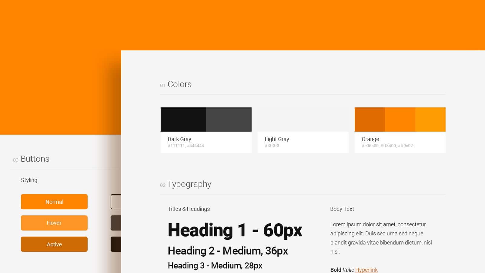
When creating a Style Guide, it is necessary to take into account the elements and visual behaviors that are constantly repeated in the website/application.
These elements are called components and are crucial when designing and implementing a style guide.
Elements such as:
- text -in block or simple paragraphs-,
- the behavior of links in all their states,
- buttons,
- images,
- navigation menu,
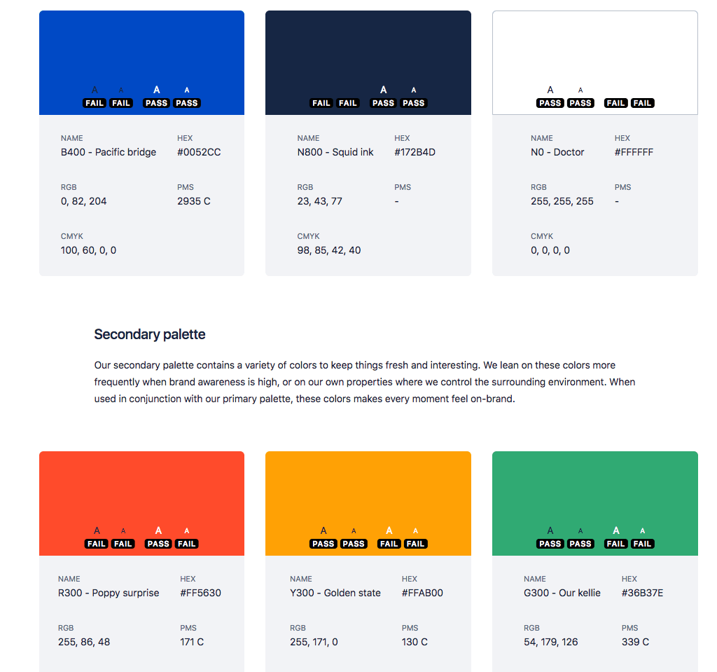
- color palette,
- basic grid, etc.
Are part, or should be part of, that universe of elements or components. Giving us a defined visual block whose elements can be easily reused.

Creating your own style guide for web design
Creating a style guide does not have to be an impossible or hard task.
Following these few steps, you can have a visual guide tailored to your requirements.
Collect basic information:
Start by gathering the basics of your site or web application: the main color palette, the size of the texts, or even the grid you use is a good start.
Select more elements until you have something solid and strong.
Add “use patterns”:
There are elements that have their own behavior. For example, the animation speed of a pop-up, the way in which the navigation menu disappears when sliding down, etc. ( We’ve got a great article about the
It is important to note all these behaviors since they are part of the dynamics of the website and its visual identity.
Update it regularly:
Wwebsites change constantly due and these changes should be reflected in your style guide.
There can be no place for ambiguity, so it is important to track any changes, however minimal, and update the visual information.
Voilá. Now you can start using your visual guide
Some would say that previously described steps are simple and easy to apply – in theory.
But these steps, alongside with hundreds of projects running at the same time, can be overwhelming, at least at the beginning.
But, if you already decided to try, and managed to do it, congratulations! You already have your first Visual Style Guide…
Now, use it!
The most important thing here is sharing what you have accomplished with the whole team. It is a guide, and therefore it must be recognized as such.
As a first step, everyone involved in the creation and visual implementation must be aware of it. Obviously, this will have many changes, even from the beginning due to the feedback process.
Perhaps an element that has apparently been overlooked is how the presentation of this guide should be. You can choose, if you are a designer, to create a template in your favorite editing program; Photoshop is usually the preferred choice by many.
On the contrary, if you have the ability to write HTML and CSS code, why do not experiment creating a style sheet with all the elements, labels, behaviors and color guides?
This usually becomes really important because, when creating modules with predefined styles, the implementation is usually simple and hassle-free, eliminating unnecessary trauma. The type of trauma that usually arises during the creation of new templates, sections or pages in your websites/applications.
There you have it: a general overview of the creation of a Style Guide.
Remember that this document is a visual guide, an element that can add not only structure to your site/application, but that will give more fluidity in your daily routine as a designer or as a developer; and, in general, to the entire work team.
Translated by Christian Zapata