One of the most striking aspects of design is the ability to generate impact and attract the consumers attention through color. According to studies, 85% of consumers feel that color is the main factor when choosing a product.
Knowing that 80% of what we assimilate through the senses is visual, it gives us a complete idea that color is an element that we can not ignore when structuring our web interfaces.
However, the color should be used sparingly. The use of only three primary colors in our scheme is more than enough, which combined with the use of shades and tints will give us a palette to play with.
So, let’s see the techniques that we can apply to use the color the right way.
The color meaning
Believe it or not, color has a physiological and emotional effect on us. No, this is not metaphysical or esoterism, is psychological. How a person feels about a color is entirely up to the individual, but the effects on the subconscious is real. Throughout history, different color schemes have been used to define different feelings and emotions depending on the person’s culture and origin.
Red: the feeling this color represents could be energy, excitement, passion and courage.
Blue: calm, safe, freedom, wisdom.
Green: Safety, harmony, stability, balance.
Black: Power, control, luxury, elegance, mystery.
White: Purity, silence.
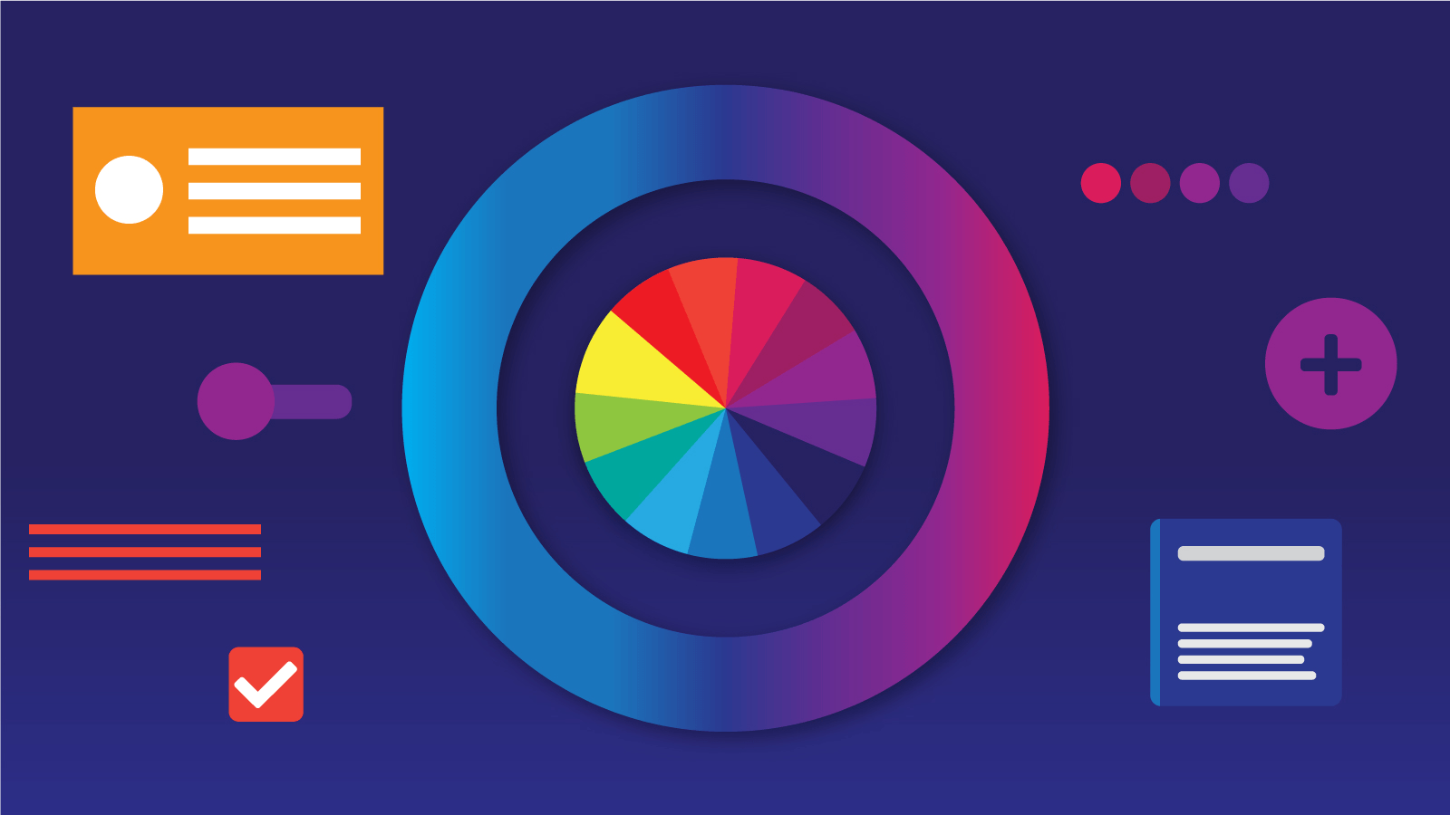
Understand the Color Harmonies
Some colors combine very well, while others simply don’t match at all. If you want your app/website to look professional and aesthetically pleasant try to understand the rules of the color wheel harmonies. These are the most used on the design field:
- Monochromatic: monochromatic colors are those that are based on a single base hue (color itself), and the variations of that particular hue.
- Complementary: Colors that are opposite of each other on the color wheel are complementary. Keep in mind that in this harmony, each of the colors equally intensifies the one across from it.
- Triadic: use colors that are evenly spaced around the color wheel.
- Analogous: use colors that are next to each other on the color wheel.

There are a couple of tools that can help you with balancing and combining colors in a more effective way. Kuler, Iris, and Material Palettes are good options to try.


Go with Grayscale First
When you’re designing your app/website you would tend to jump directly on applying colors and tints to your elements. But that approach could be a little risky at first. You could end up with a beautiful and good looking app/website, but with a terrible composition or layout.
Try to layout your elements first, focus your efforts on spacing, sizing and rearrangements of them. Do you need to enhanced some components? Try different shades of gray to enhance the differences on the particular elements and you’ll be good.
Pure black: no, please
In nature, we can see different tones and tints everywhere. But one thing is for sure: the pure black -almost- never exists. If you can see a shadow of something you’ll perceive that its color goes from different tones, like a gradient of grey color.
So, to follow the nature’s wisdom, avoid the use of 100% black on your UI and replace it with a grey variations in your designs. Try always to add a bit of saturation to your color, it will look more natural and familiar to your users.

Here you can see we’re not using pure black or white.
Only shades of grey, avoiding the complete #000 or #fff
Don’t be afraid of color
There are many more tools and ways to play with color in our designs. Since it is a very important aspect on the UI side of your app/website, a correct and properly use of color could take your design to another level and make that your users enjoy it a lot. So, don’t hesitate to experiment with tones, shades and tints in your creations, just remember the previous rules we talked about and have fun.