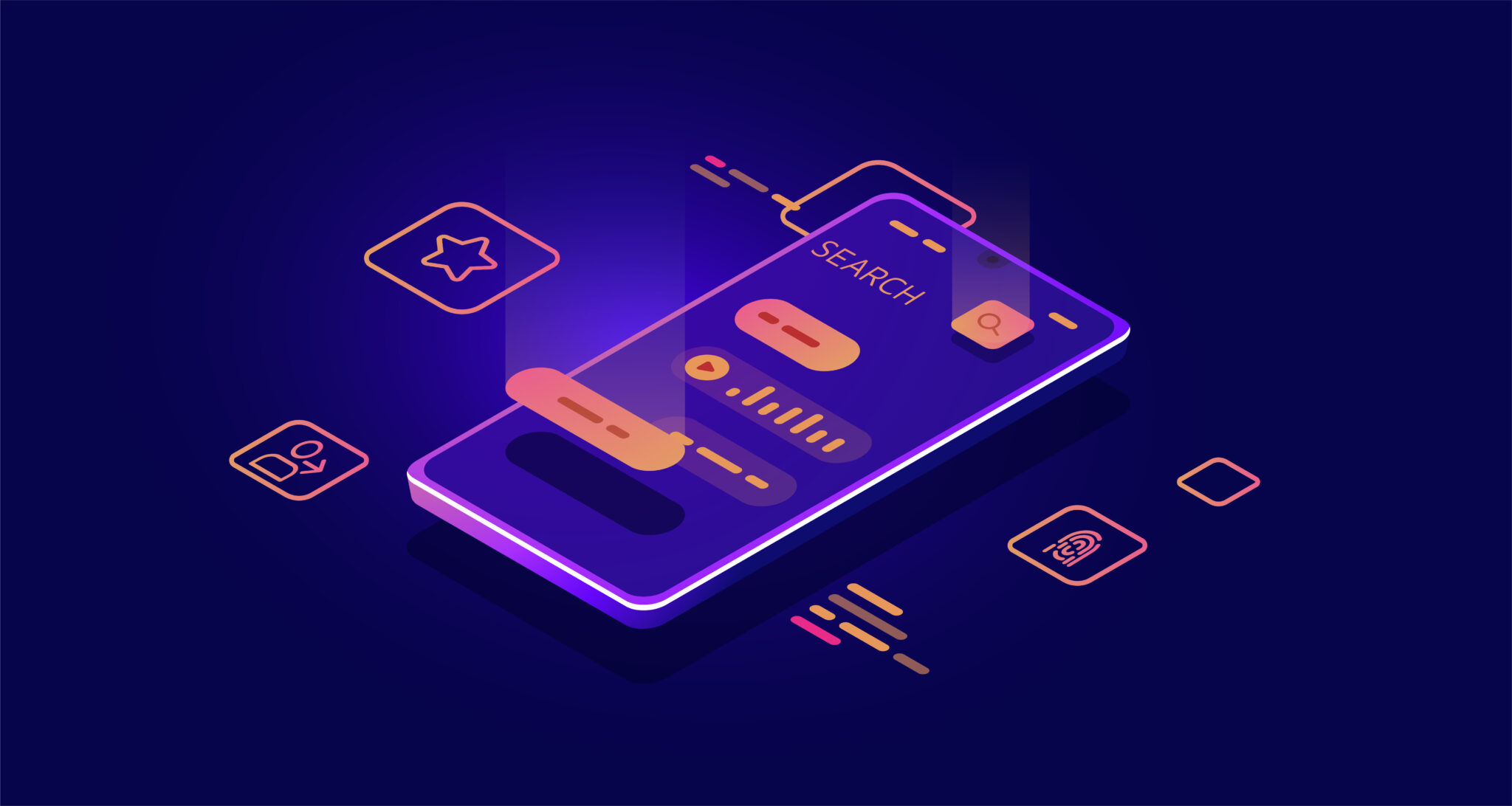
Interface Design is a career that involves not only knowledge on visual aesthetics but usability principles to make effective the using of your app for your users. Your mobile app must be useful and intuitive, two concepts that play a huge role in the design face and that carries an important weight when making your app reliable and valuable.
Good UX/UI helps the mobile app to be user-centric. What is user-centric? It is the way we put all the importance and efforts to our users, focusing our design on the objectives and goals they have. So, our product must be concise and have no room for confusion or a lack of clarity.
In the mobile field, design with user-centric approach becomes even more important. Tiny screens compared to desktop devices make the usability harder if we can’t bring an appropriate solution for our content. So, let’s see a couple of guidelines to make your mobile app easy to use and navigate:
Keep navigation simple
Navigation is the most important element because it allows your users to move between your app and access to the provided content. For that reason, navigation must be easily accessible, avoiding the unnecessary levels on it -like submenus-. Also, try to be very clear on the labeling of each item, making your text on them concise and precise.

Reduce content to a minimum
Users want to resolve their problems and achieve their goals in the fastest possible way. A content that seems chaotic or too cluttered distract the user from its main purpose and destroy its efficacy on performing its tasks. So, removing anything on mobile that isn’t necessary improves the comprehension of your content and the speed at which your users use your app.
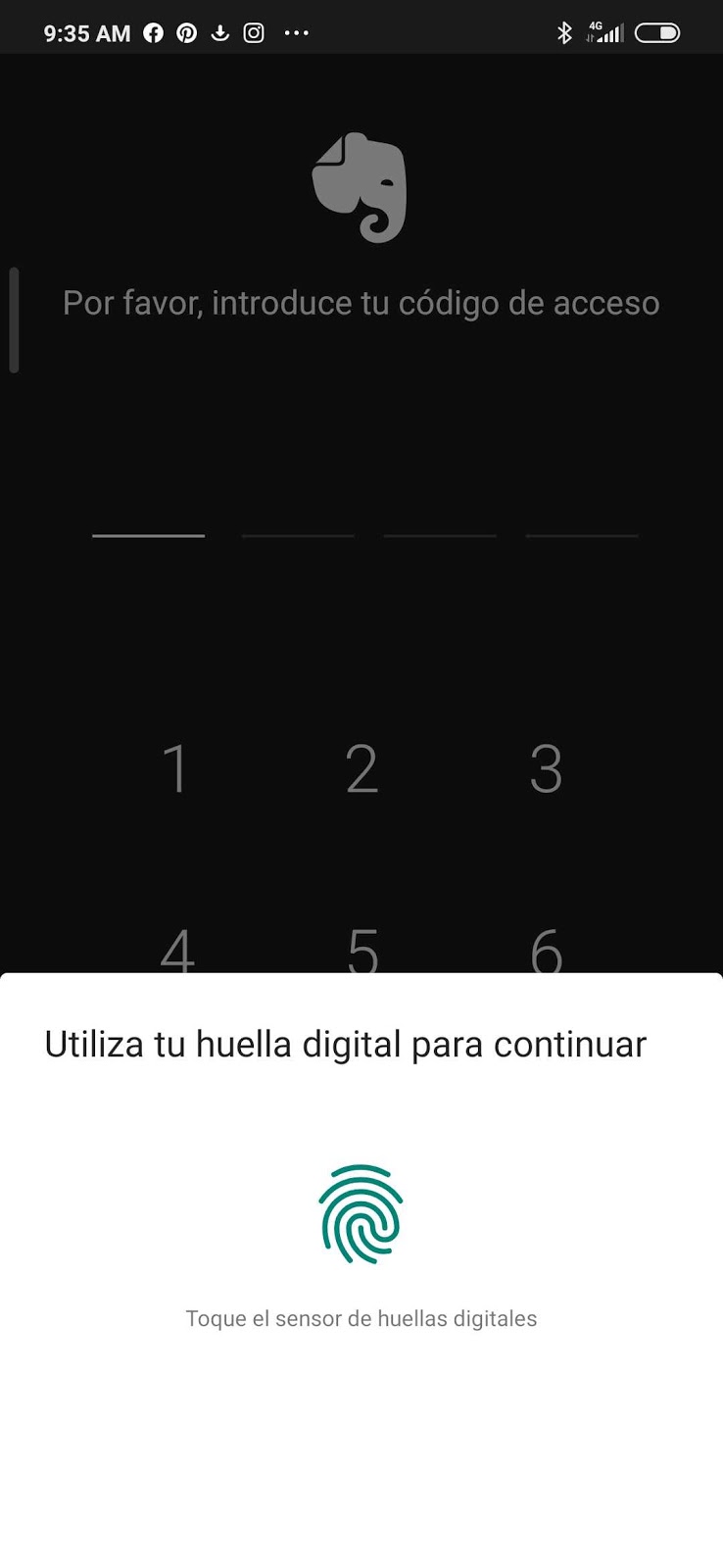
Reduce the inputs required from users
We all know the boring and tedious part of filling inputs. It’s something that if we can not avoid it, we must ease how we present it to the user. The less the user fight with the mobile device, the better it will feel when using it. So, in that case, consider offering alternatives to input mechanics, such as voice or fingerprint authentication.
Design with finger-friendly tap in your mind
In smaller screens, tap in an element could be very complex if the correct size of the elements is too small. This causes frustration to the user and adds a layer of complexity to your app. Smaller tap target is harder than larger ones, so try to implement controls that measure between 7 – 10 mm and its border visible when tapping on it. This provides immediate visual feedback to your final user about what he/she is going to trigger.
Use the correct font size to make your content legible
It’s a challenge to show content in the proper manner in a mobile device. Imagine a content that has a lot of text and hundreds of lines. Trying to design and apply the UX/UI rules here seems to be far from easy. But there are some kind of principles you can apply to win the day on this topic:
- Your text must have 11 points/px at a minimum for proper legibility without zooming
- Increase line-height, letter-spacing and tracking to create room for blank space in your text.
- Try to not use pure black on your text to avoid higher visual contrast. Instead, reduce the pure black with shadows of grey to refresh the eye on larger blocks of text.
Design controls based on hand position
According to Steven Hoober research, 49% of people rely on a one thumb to get things done on their phones.
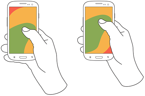
Comfort zones for a user on his mobile phone.
Image Source: uxmatters
In this case, the position of elements on your app according to the difficulty of reaching them is vital to allow your users to avoid accidents on the manipulation of negative actions – as delete or erase-. Also, placing the top-level menu and frequently-used controls in areas where common action takes place is a safe move on this approach.
Conclusion
The previous guidelines are just simple tips to create better interfaces and to give your users the ability to perform their actions in a better way. Remember that design is not only the aesthetics of your app but all the considerations that relate to the user-centric approach and usability, making your app easy to learn, valuable and friendly. There’s much more concerning mobile UX and UI, but if you take into consideration these initial steps, you can save you a lot of time and troubles that no application of them could carry out.