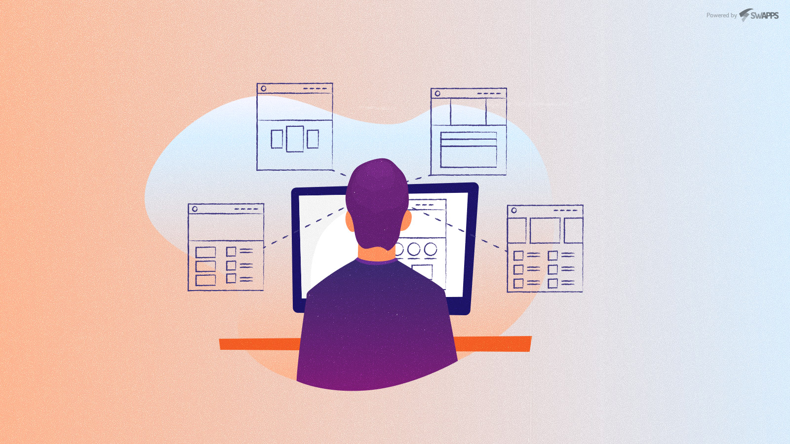
How does Psychology relate to Web Design?
This is where the Gestalt principles come into play. Gestalt – a German word that means form – is a psychological concept that basically explains how we interpret reality. This concept explores visual perception and proposes a series of principles that describe how we visually group information. Let’s briefly describe these elements and how we can use them in the design of interfaces:
Perhaps, too many designers overlook the importance of psychology within the creative process and the impact that some of its principles has in the design choices that are made on a daily basis, whether printed or digital.
Why Gestalt Principles Matter for Web Design
In web design, these principles are effectively applied in the field of User Interface (UI), allowing the messages to arrive in a pleasant and dynamic way, guiding the visual perception of it.
And it is precisely visual and spatial perception, two of the main topics that psychological principles study.
People group the information received through our five senses and try, either consciously or unconsciously, to give it meaning in an orderly and comprehensible way.
Modern web design faces unique challenges:
- Mobile-first experiences require efficient use of limited screen space
- Dark mode interfaces change how visual grouping works
- Accessibility standards (WCAG 2.2) demand inclusive design
- Attention spans continue to decrease, making intuitive navigation critical
- Complex web applications need clear visual hierarchies
Gestalt principles help address all these challenges by creating designs that work with human psychology, not against it.
Measurable Impact:
- Improved user engagement and task completion rates
- Reduced bounce rates through clearer navigation
- Better accessibility for users with cognitive differences
- Faster information processing and decision-making.
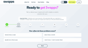
Creating interfaces that reduce bounce rates and guide users naturally is a complex task. If you’d rather skip the experimental design phase and ensure conversions from day one, you can use Swapps’ modular structures. Check out our options on Get Swapps and discover how we set up ready-to-use visual architectures.
Essential Gestalt Principles for UI/UX Design
1. PROXIMITY Grouping Related Elements
We perceive objects that are close together as similar.
How does it apply to the UI design?
We can leverage this principle by grouping similar information, such as sections within a page/web application, or navigation buttons. Being so close, the white space plays a fundamental role in allowing the eyes to rest.


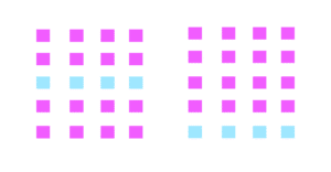
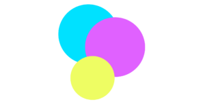
2. SIMILARITY – Creating Visual Consistency
We perceive objects that share the same characteristics (color, shape, size, texture, and orientation) as being part of a set, even when they are not adjacent or closed positions.
How does applying Similarity to the UI design work?
Elements that share the same characteristics are part of a group. These can be elements of a page or application interface, such as web links in the nav menu or price cards.


3. Figure-Ground – Establishing Visual Hierarchy
We instinctively separate objects (figures) from their backgrounds (ground), perceiving them as distinct layers.
How It Works in Modern Web Design
This principle is essential for layered interfaces-modals, dropdowns, tooltips, and navigation overlays all rely on clear figure-ground relationships.

Current Applications:
- Modal dialogs – Content in foreground, dimmed background
- Navigation drawers – Slide-out menus over main content
- Tooltips and popovers – Clear distinction from page content
- Hero sections – Text/CTA separated from background images
- Glassmorphism effects – Frosted glass separating layers
Accessibility ConsiderationEnsure sufficient color contrast between figure and ground (minimum 4.5:1 for text). Use aria-modal=”true” and trap focus within modals.
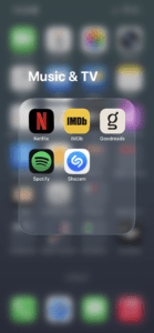
4. Common Region – Boundary-Based Grouping
Elements contained within a visible boundary are perceived as a group, regardless of their individual characteristics.
How does the Common Region apply to the UI design?
Common Region is the principle behind card-based design, which dominates modern interfaces. Borders, backgrounds, and shadows create clear containers that organize information.
Current Applications:
- Card components – Product cards, blog cards, profile cards
- Sidebar panels – Distinct background colors separate navigation from content
- Pricing tables – Each plan is contained in its own region
- Dashboard sections – Metrics grouped in bordered containers
5. Closure – Simplifying Complex Designs
Our brains complete incomplete shapes or objects, filling in missing information to create whole forms.
How Closure Works in Modern Web Design
Closure allows designers to use minimalist iconography and simplified visual elements without losing meaning. This principle is why outline icons work perfectly well alongside filled ones.
Current Applications:
- Icon systems – Outline icons (most popular in 2025)
- Logo design – Negative space logos
- Loading animations – Incomplete circles or progress indicators
- Breadcrumb navigation – Truncated paths users mentally complete
- Hamburger menus – Three lines suggest a menu without showing it

Accessibility Note: Always include aria-label for icon-only buttons. Don’t rely on closure for critical information—some users may not complete the pattern.
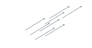
6. Continuity – Guiding User Flow
We perceive elements arranged on a line or curve as related and follow the path they create, even when the path is interrupted.
How Continuity Works in Modern Web Design:
Continuity guides users through content hierarchies, forms, and multi-step processes. It creates a visual flow that intentionally directs attention.
Current Applications:
- Multi-step forms -Progress indicators with connecting lines
- Timeline layouts – Chronological content with vertical lines
- Horizontal scrollers – Cut-off content suggests continuation
- Reading flow – F-pattern and Z-pattern layouts
- Breadcrumb trails – Connected navigation path

7. Common Fate – Creating Dynamic Interactions
Elements moving in the same direction or changing synchronously are perceived as a unified group.
How Common Fate Works in Modern Web Design:
Common Fate brings static designs to life through coordinated animations and transitions. It’s essential for modern micro-interactions and state changes.
Current Applications:
- Accordion menus – Multiple sections expanding/collapsing together
- List animations – Items entering/exiting in sequence
- Parallax scrolling – Background elements moving at different speeds
- Carousel indicators – Dots or thumbnails highlighting active state
- Loading states – Multiple skeleton screens appearing together
- Some of the Gestalt principles are applied to the user interface.
- Principles that will help us complete our mission in the field of web design: communicate.
- At the end of the day, that is what the design of interfaces aims:
- to bring in a visual and pleasant way a message to the many users that an application or website has.
Adapting your platform to WCAG 2.2 standards, optimizing dark mode, and ensuring that your user flows work seamlessly require ongoing technical support. Instead of tackling everything from scratch every month, you can leave it to our expert team. Explore our Swapps Support and Maintenance Plans and enjoy peace of mind knowing your visual and technical infrastructure will always be up to date.
Conclusion
Gestalt principles provide a scientific foundation for intuitive interface design. By understanding how users naturally perceive and organize visual information, you can create experiences that feel effortless and guide users naturally through your content.
Key Takeaways:
- Proximity creates visual hierarchy through spacing
- Similarity builds consistency across your interface
- Figure-Ground establishes clear layers and focus
- Common Region organizes information in containers
- Closure enables minimalist, efficient design
- Continuity guides users through flows and processes
- Common Fate brings designs to life with coordinated motion
Start by auditing your current designs against these principles. Look for inconsistent spacing, weak groupings, or unclear hierarchies. Then systematically apply these principles, starting with proximity and similarity, before adding more advanced techniques.
Remember: These principles work best when layered together, reinforcing rather than contradicting each other. The goal isn’t to apply every principle to every element, but to create harmonious interfaces where visual perception aligns with user intent.
Applying visual psychology is just the first step in creating a robust digital platform. If you have technical questions about scaling your operations or want to better understand your site’s architecture, explore our knowledge center. Find clear answers and expert documentation in the Swapps Resources section, where we’ve compiled our development guides, frequently asked questions (FAQs), and technical support center.