The musical pieces have an internal structure that makes it easy to listen to – whatever the type of music is. Musical compositions must have form and be part of a whole, of a global compound in which each of its parts can form a particular rhythm.
Well, this concept is not indifferent to typography, since a text with a well-established structure – visually speaking – is more pleasing to the eye and less complicated to read than one that does not have such form. After all, our brain is a pattern recognition machine, and it tends to get confused and reluctant to find elements that are not symmetrical or have no defined shape.
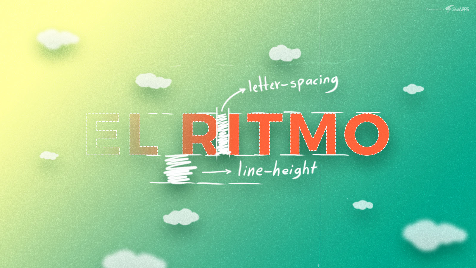
So let’s talk about the two kinds of rhythm we can find when structuring our texts to communicate a message.
Horizontal Rhythm
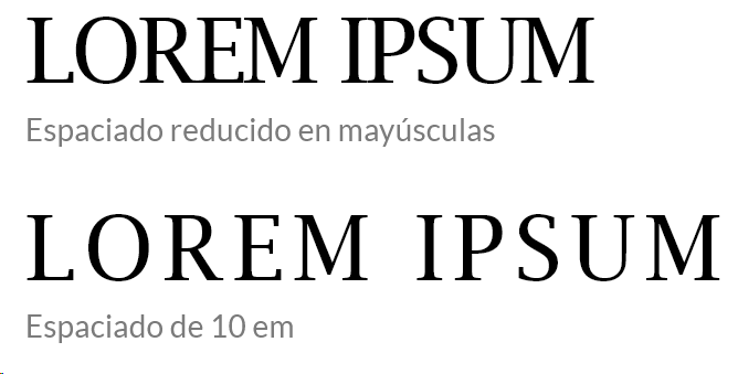
Horizontal rhythm is defined as the horizontal space between characters, directly affecting the readability of a body of a text. This space is defined by the CSS property: letter-spacing, a property that handles what is called the Tracking of the present text.
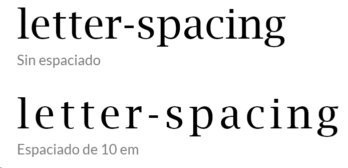
Although useful at times, the letter-spacing property should be used with too much caution, since its impact on reading is quite important: misused, it can make words more difficult to read and decipher by our brain, causing a decrease in reading speed.
A very good reason to use this property may be when the text is capitalized. In this case, increasing the tracking slightly by means of letter-spacing can make the text much more readable, increasing the recognition of the characters in it.
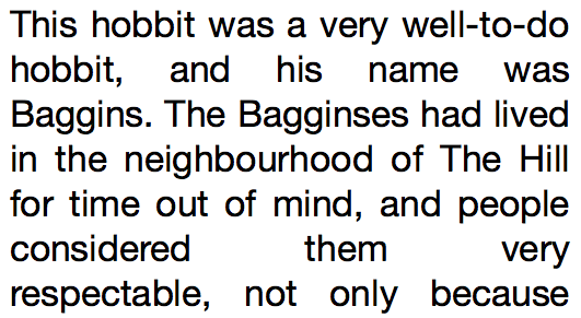
Another important element within the horizontal rhythm is the justification of a block of text. Has it not happened to you – and I am sure that it is so – that when writing in your favorite text editor the word blocks are more organized if they tend to have a balance on each side, without broken lines? Well, this is justification, and although in printing it is not so complicated, on the web we have a dilemma: browsers still do not have the necessary calculations to generate efficient spacing between words and even letters, generating white patches between phrases and blocks.
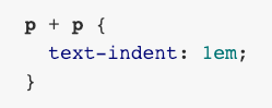
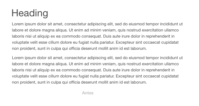
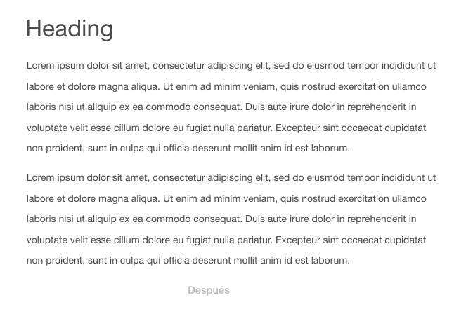
Indenting the first line of a block of text is also part of the techniques to maintain a horizontal rhythm, something widely used in books and magazines. But on the web we must consider a key element:
- Do not indent the first line of a paragraph that comes after a title, image, or any other element. This is easily accomplished with the text-indent property applied only to paragraphs that are adjacent to other paragraphs.
This point is easily forgotten when we are generating text on the web with the indentation feature, causing the text to become somewhat asymmetric and not very stylized.
Vertical Rhythm
In the vertical rhythm, the same principle of the horizontal is followed: to make the elements maintain consistent spaces between them. Here, we will use two important elements to define these spaces and generate a balanced rhythm: the grid and the baseline.

The baseline is achieved with the CSS line-height property applied to the text in question. Keep in mind that the applied values must be multiples of the value in which we initially want our base grid. Although complex, we will understand it better with an example:
Suppose we have defined a 24-pixel base grid. Now, our next step is to define our baseline, whose value will be 48 pixels, multiple of 24, which will be used in our h1 tag that makes up our title. We will also use a margin to adequately space the paragraphs of other elements.

The rhythm and vertical structure are greatly improved by applying a grid and baseline.
Observing the two previous examples, we can see that the general balance and the rhythm change the way in which we perceive the inferior text, being this one more attractive and simple to the eye.
This concept of grid and baseline is powerful because it puts into operation the law of Repetition, that is, using the same or similar elements in a set, in our case, using the same measures to create a defined structure in our text. Each paragraph is adjusted to a specific measurement that is repeated throughout the text, forming a continuous pattern that our brain recognizes.
Taking into account the vertical and horizontal rhythms gives us the ability to optimally structure our websites. Taking into account the previous points, we can generate balance, control and dynamism to the typographic elements that make up our website or application.