CSS Grid: The Ultimate Layout Tool

CSS grid technology represents a completely new way of thinking web layouts, a way in which you are in full control of the presentation. No more weird HTML nesting and non-semantic elements here and there to assist our layouts. Unlike any other tool available in CSS, the Grid features a powerful and comprehensive two-dimensional grid system, this basically means that you will be placing elements in an X/Y quadrant.
Before jumping into the details of its implementation, keep in mind that this technology has been around for a few years and as of today all major browsers support it without vendor prefixes, covering more than 90% of the global users. So It is safe to use it.
In this article, I’m going to expose the basic usage so you can familiarize with syntax and its behavior.
Setup the Grid Container
.grid {
  display: grid;
  grid-template-columns:
    [left1] 100px
    [left2] 100px
    [center] auto
    [right1] 100px
    [right2] 100px [end];
  grid-template-rows:
    [row1] auto
    [row2] auto
    [row3] auto [end];
  grid-column-gap: 1em;
  grid-row-gap: 1em;
}
The code above shows how the syntax looks on the grid container element. As you can see, most of it is easy to grasp, the display: grid initializes the grid layout system, then we declare the column/row structure and the gap or spacing between the items inside the grid.
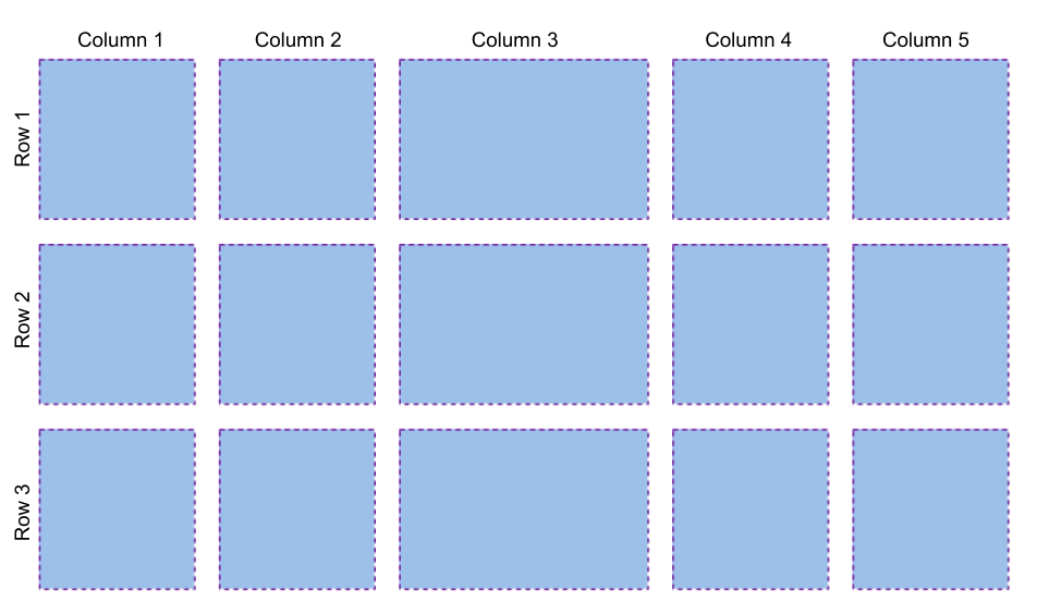
Each value inside grid-template-columns or grid-template-rows represents the distance between grid lines and the texts inside the square brackets are optional names that we can set to the grid lines. In the example we are initializing a grid with 5 columns and 3 rows, the grid will look like this:
Place Items in the Grid
Now that we have our grid container initialized and set up, we can proceed to place the items, which are the direct children elements of the grid container. In the HTML below the grid items are six: header, nav, main, aside#sidebar1, aside#sidebar2 and footer:
<div class="grid">
  <header><h1>The Page Title</h1></header>
  <nav>
    <ul>
      <li><a href="#">Home</a></li>
      <li><a href="#">Blog</a></li>
      <li><a href="#">About</a></li>
      <li><a href="#">Contact</a></li>
    </ul>
  </nav>
  <main>
    <h2>Recent Posts</h2>
    <article>
      <h3>Post title</h3>
      <p>Some lorem text here</p>
      <p>Second paragraph</p>
    </article>
  </main>
  <aside id="sidebar1">Sidebar 1</aside>
  <aside id="sidebar2">Sidebar 2</aside>
  <footer>Last one</footer>
<div/>
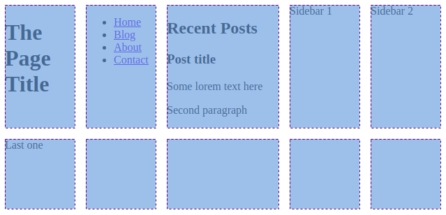
By default, the items are placed one on each cell of the grid:
To change how we display items in the grid, we can use grid-column and grid-row, the syntax works this way:
grid-column: <start line> / <end line>;
grid-row: <start line> / <end line>;
To build a basic 3 column layout, we can add with these set of rules:
header {
  grid-column: left1 / end;
}
footer {
  grid-column: left1 / end;
}
nav {
  grid-column: left1 / end;
}
main {
  grid-column: center / right1;
}
#sidebar1 {
  grid-column: left1 / center;
  grid-row: row3;
}
#sidebar2 {
  grid-column: right1 / end;
  grid-row: row3;
}
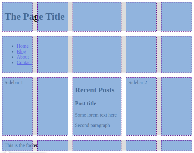
This is the result, with the grid highlighted on top for reference:
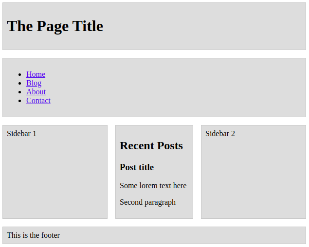
Without the grid:
Grid Templates
This is another very helpful option we can use. Instead of setting the location properties on each item, we can also do it within the grid container element. This works by labeling the item with grid-area:
header {
  grid-area: header;
}
footer {
  grid-area: footer;
}
nav {
  grid-area: nav;
}
main {
  grid-area: main;
}
#sidebar1 {
  grid-area: sidebar1;
}
#sidebar2 {
  grid-area: sidebar2;
}
And specifying the layout in the grid container with the property grid-template-areas:
.grid {
  ...
  grid-template-areas:
    'header header header header header'
    'nav nav nav nav nav'
    'sidebar1 sidebar1 main sidebar2 sidebar2'
    'footer footer footer footer footer';
}
The result will be exactly the same.
New Functions and Units
FR unit
The “fr” unit represents a fraction of the available space in the grid container. Usage:
grid-template-columns: 1fr 2fr 1fr 1fr<br>
Repeat function
repeat() function represents a repeated fragment of the tracklist, allowing a large number of columns or rows that exhibit a recurring pattern to be written in a more compact form. Usage:
grid-template-rows: repeat(3, auto)
Minmax function
minmax() function defines a size range greater than or equal to min and less than or equal to max. Usage:
grid-template-rows: minmax(200px, 1fr)
The Grid is Responsive
As you might expect, the grid works perfectly fine with media queries but there’s more than that. The grid can be responsive by itself. There are techniques to achieve that like combining the repeat() and minmax() functions. For example, consider this configuration:
.grid {
  display: grid;
  grid-template-columns: repeat(auto-fit, minmax(240px, 1fr));
}
.grid > * {
  padding: 0.5em;
  background: #ddd;
  height: 100px;
}
It will produce this responsive behavior:
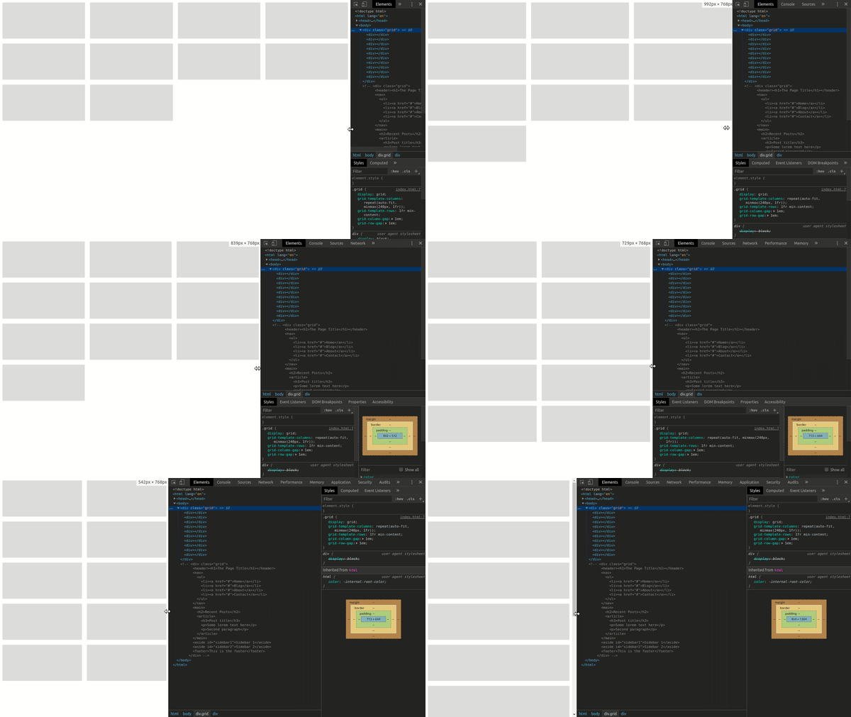
Pretty cool, right? Not a single media query used. But what happens here is a bit harder to grasp, so let me try to break it down for you:
- The minmax function sets the minimum and maximum width allowed for the columns, in this case, 240px and 1fr.
- And the auto-fit value in the repeat function is forcing the browser to add as many columns in one row and then also span them a bit in order to fit exactly the space.
Want to Learn More?
Please take a look at these useful resources:
- https://css-tricks.com/snippets/css/complete-guide-grid/
- https://css-tricks.com/look-ma-no-media-queries-responsive-layouts-using-css-grid/
- https://developer.mozilla.org/en-US/docs/Web/CSS/grid
- https://www.youtube.com/watch?v=7kVeCqQCxlk
- https://cssgrid.io/
Conclusion
It’s no secret for web developers that the structure of the content on the web page has been a big issue since the beginning of the web. In the early days, something as simple as displaying multiple elements side by side can only be achieved with tables, but tables became useless in the mobile era.
The appearance of CSS meant a huge leap forward because It came with more tools for layout like floats, inline-blocks, relative/absolute positioning and later Flexbox. But none of these tools or techniques work well in more challenging situations. For this reason, the grid was invented: to solve these layout problems without HTML or Javascript hacks.


