As designers and developers, we need to take into consideration all the people that reach our apps/websites, including the people that are visually impaired. Our creations should be, or at least try to be, suitable for them, including those with less than 20/20 vision.
That’s why the Web Content Accessibility Guidelines, WCAG was created, to be a standard in accessibility and provide to individuals, organizations and governments the tools for making web content more accessible.
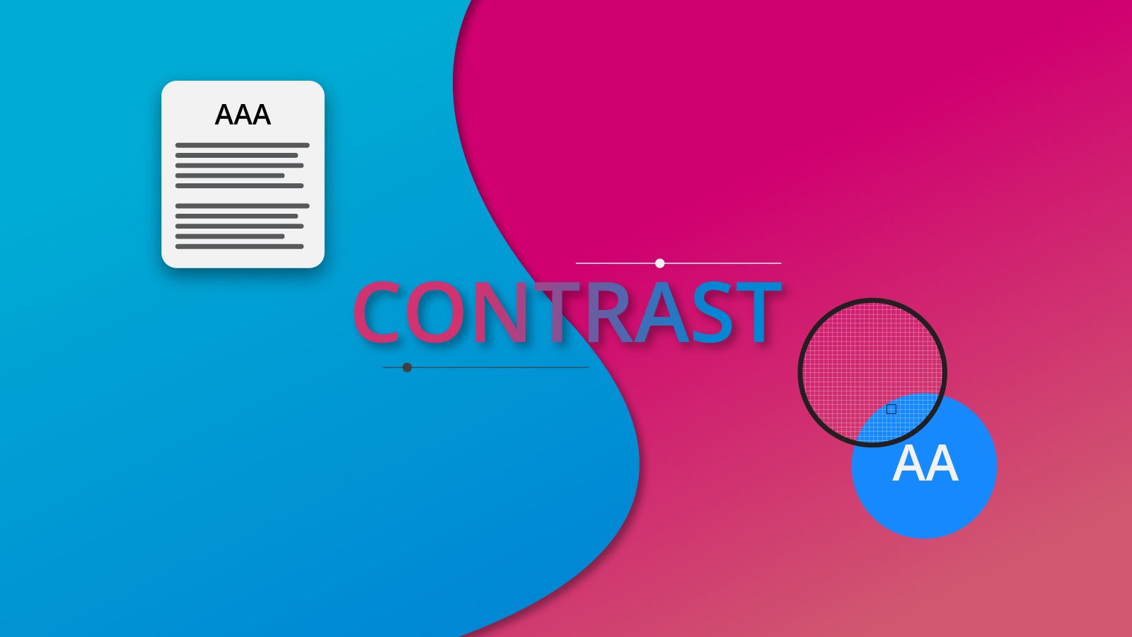
Let’s see what the accessibility standards outlined on the WCAG 2.0 tell us concerning contrast, that is to say, the foreground and background color when it comes to text.
Google Chrome browser added a new feature to its Web developer tool.
The last item shows the Contrast section.
RATIO
WCAG determines level of contrast according to the Relative Luminance equation. Put it simple, the equation shows a number between 1 and 21, with 21 being the highest amount of contrast and 1 being no contrast at all. For example, white text over black background would be 21 on ratio, and black text over black background would be 1.
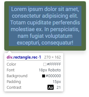
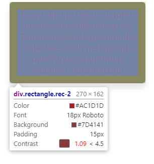
In the image above, you can see that different text over background colors generates different contrast ratios. You can even observe a little rectangle with the background color and the text color over it. The contrast ratio number is next to this tiny preview. Do you see the less than symbol in the contrast ratio figures? It shows you that the number doesn’t reach the minimum to pass as a valid score. Let’s see what’s score is and how is related with the contrast ratio.
SCORE
Between 1 and 21 there’s a spectrum. So, a score is generated from comparing the spectrum of the given element you are revisiting. These are:
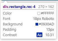
AAA
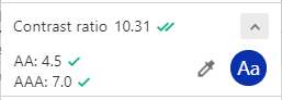
Means that your text has a contrast ratio of at least 7.0. For example, a f6f6f6 color text over a 0930ad generates a triple A score. (See image below).
But consider something: section 1.4.8.1 of the WCAG states that: “Foreground and background colors can be selected by the user.”. So, an app/website would be AAA only if the user can change the background and foreground colors. My recommendation is that, unless you are planning to create a feature that allows the user to do exactly that, don’t worry too much for this type of score.
AA
This score means that your text has a contrast ratio of at least 4.5 or higher. This is the same score as AAA Large. In the previous image you can see that the color contrast enters on this score too. Why Large? Well, the WCAG describes 14pt bold and 18pt as “large sizes”. But this could be an approximation, since letterform sizes can vary between typefaces. For example, a 14pt size on a Lato typeface font could appear smaller than PlayFair Display typeface.
AA Large (AA+)
AA large means color contrast that reach at least 3.0 in contrast ratio. This score is derived from WCAG comparison for the minimum level recommended by ISO-9241–3 and ANSI-HFES-100–1988 for standard text and normal vision.
Remember, all of this scores and numbers are aimed to improve your design elements for your users. So, don’t overlook these guidelines.
FAIL
This score means that your text has a contrast ratio of 2.9 or lower. Just consider that this numbers and guidelines does not apply to logos, text in logos and other decorative elements.
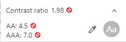
Unfortunately, this contrast ratio doesn’t reach the level to pass the test, so it fails.
So, in order to achieve the best experience for your users, you need to take into consideration these guidelines for your text and its contrast in your app/website. Although in this part we focused on text, there’s much more in the WCAG document. For example, in Visual Presentation:
(Level AAA)
For the visual presentation of blocks of text, a mechanism is available to achieve the following:
- Foreground and background colors can be selected by the user.
- Width is no more than 80 characters or glyphs (40 if CJK).
- Text is not justified (aligned to both the left and the right margins).
- Line spacing (leading) is at least space-and-a-half within paragraphs, and paragraph spacing is at least 1.5 times larger than the line spacing.
- Text can be resized without assistive technology up to 200 percent in a way that does not require the user to scroll horizontally to read a line of text on a full-screen window.
For instance, your app/website could have a AAA on text contrast, but if you don’t allow your users to select foreground and background colors, your product simply doesn’t fit that score.
These guidelines could be very complicated to achieve at first glance, and maybe some parts of them will be strange, but with practice you can reach your goal: make your User Interface accessible for everyone in the world.