When we, as users, navigate through a website or app we click here and there in different parts of the interface. While we’re doing this, we usually overlook one of the vital elements on every design system: the button.
Buttons have a special meaning in the interface, since they create a positive and productive User Experience (UX) throughout the site. Buttons are styled links that grabs user attention in a particular direction or let the opportunity to perform some kind of task or action they need, such as submitting a form or making a purchase.
Here, the question arises: how can we, as designers, enhance our buttons and create better ones? To answer that question, let’s see first the different kinds of buttons that you can find and their corresponding uses throughout the interface.
TEXT BUTTONS
The text buttons are text labels that falls outside of a block of text. They have a low level of emphasis to less important actions. As they don’t have a container, they don’t distract the user of nearby content.
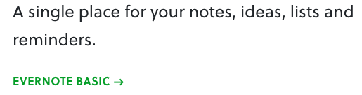
Button text below a short description on Evernote.
Look how the button, even thought is just text, implies an action
with the right arrow.
GHOST BUTTONS
With mayor complexity and emphasis than the previous one, ghost buttons indicate important actions, but not the primary action on a page. Generally, they don’t have any fill or shadow, hence its name.
RAISED BUTTONS
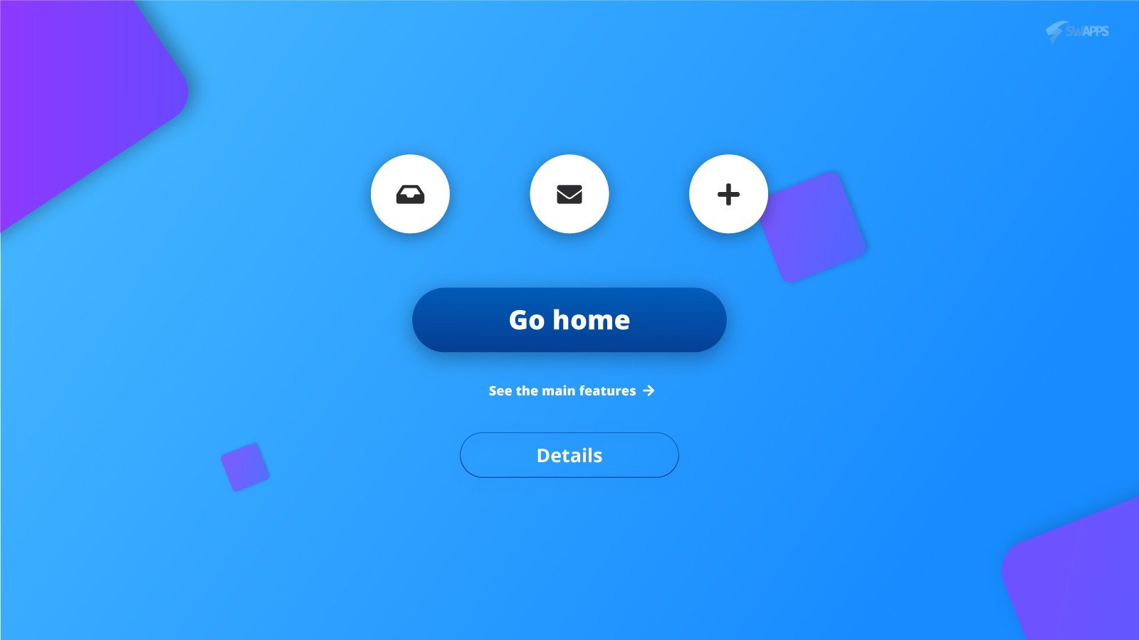
Raised buttons tends to be the most important in specificity and emphasis in the interface, because they communicate actions that are primary on the page. They pop up from the surface using a drop shadow, indicating and interactive approach: click it or pressing it. This kind of button adds dimension and dynamism to the interface.
TOGGLE BUTTONS
Toggle buttons usually group related options in a particular action. Also, they showcase a selected action or setting in the interface.
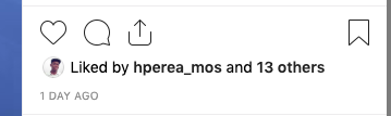
A like in a photo showcase a selected action, as the red hearth shows.
FLOATING ACTION BUTTON
This button performs a constructive action, a common task on the screen such as: share a publication, create a new item or send a message. Usually, these buttons are circular, with an icon and with a subtle shadow to stand out from the surface, as in the raised button.
button with an icon that indicates a message.
PRINCIPLES TO MAKE BETTER BUTTONS
Now that you know the main types of buttons that exist, we can move on and talk about the principles to make your buttons shine. Take a look at these points to leverage the quality of your elements on your next web design project.
Make buttons recognizable
Every item in the interface has a purpose, has a meaning that users relate to previous experience. So, if for some reason the element is not recognizable, users will tend to be confused and its speed will go down considerably while they navigate through the site or app. For that reason, your button must looks like, well, a button. Don’t make your users guess what kind of strange element that floats around some part of the interface is.

Use visual identifiers
Such as size, shape, color and shadow to convey the importance and the emphasis of the button. Remember, for example, that if the button triggers an important action or it is used as a CTA (Call To Action) this must be bigger and more prominent than any button around.
Your users must interpret the button clickability faster
So make it obvious. Don’t create elements that distract the user from its main purpose or action when using the button. Also, remember that the usability of your interface depends on how the users feels the entire site/app, so if a button is very aggressive or delicate it will affect the general idea of your design system.
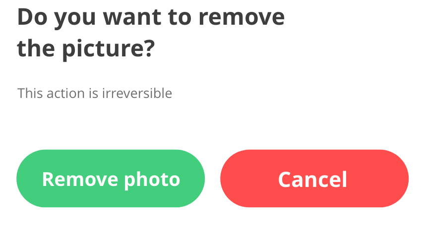
Label them with the corresponding action they executed
For example, suppose that you want to delete a photo in a photography app. When you hit the button, there’s a pop up that emerges.
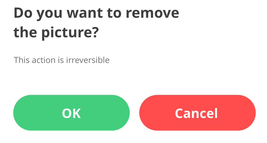
Although for you, as a designer and probably for some people the message seems to be clear, don’t assume that all user has the same understanding. The idea is that buttons has its corresponding action as a label. So, why not using that approach?
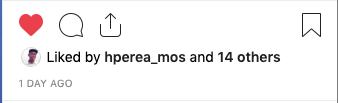
Try to provide visual feedback on interaction
Users expect feedback after an interaction with every UI element on your app or website, and buttons are not the exception. In fact, buttons must show any kind of response when they’re clicked, such as shadow decrease its size but increase its opacity when its clicked, or a subtle background change when it’s over it.
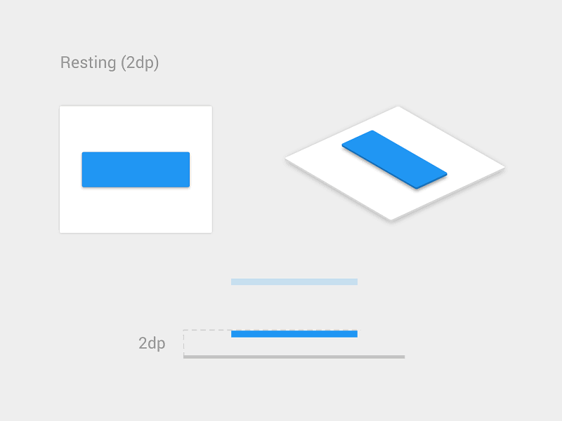
Button feedback interaction on pressing and release.
Photo: Vadim Gromov
In conclusion
Buttons seems to be an easy element that could be unnoticed most of the time, but if you want to create gorgeous user interfaces and structured design systems, master the use of these elements is a priority. Buttons not only make your users navigate through your site/app but create an atmosphere, enhance your layout and, if they are well designed, send the proper message to your audience.