5 Donation Page Best Practices

It is not new that donations are a major part of nonprofits and charities. So accordingly, here we show you how to improve your donation page.
Donations can be received from many different sources.
In this article we will focus on Online Donations through your website.
The donation page will assure you a steady stream of donations if it applies best practices or do the opposite if it is disorganized and confusing.
So here we’ll give you a list of 5 Donation Page Best Practices you should take into account to boost your online donations through your website:
Visit: Benefits of having your own website
Make it easy to get to the donation page
A prominent, highlighted and sticky donate button that appears in every page of the site is very important.
So people are guided to the donation page and don’t get lost finding it.

Visit: 3 fast fundraising ideas for nonprofits to boost donation through your website
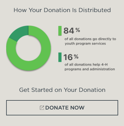
Be transparent on where donations go
Evidently people are more willing to donate when they are sure that their money will be well spent.
With a clear statement on where the donated money goes, you can make the donation conversion more viable.

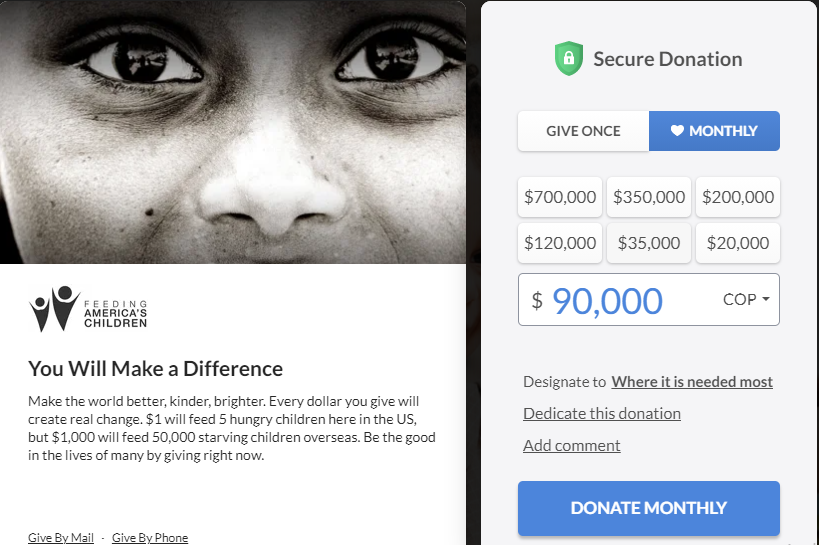
Have different donation options
Off course you should propose different donation plans.
From one-time donations to monthly giving options, you can even add a direct link to the Amazon Smile option of your organization, for example.

Visit: 5 Donation options you can give to your Donors and increase fundraising
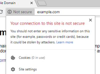
Have SSL configured in your Donation Page
SSL makes your site secure, so with more reason your donation page should have this.
Certainly your donator should feel safe making the donation and entering sensitive data in your donation page.

Here you can see a post on how to use a free SSL certificate.
Have different payment options
Make it easy to your donator having different options for him/her.
When they are in the payment process its because they have already made a decision on contributing.
So make this experience smooth and as easiest as possible for them.

We can help!
Our main purpose is to help you focus on your mission while we take care of your tech.
If you want to boost your donation page or even improve your whole site, we are here to help. Let´s talk
Related blogs


