Brand
The following guide was made for the software developer company Swapps with the objective of planting the bases of design and identity of the company and thus guarantee the correct implementation of the logo and the graphic elements that compose it.
Swapps Icon
The icon is the minimal expression of the logo, represents the brand in an appropriate way to achieve the memory in people.

Swapps Isotype
Represents the iconic part of the brand. It will be mainly used as an avatar, favicon, or when there is not enough space to use the logo.

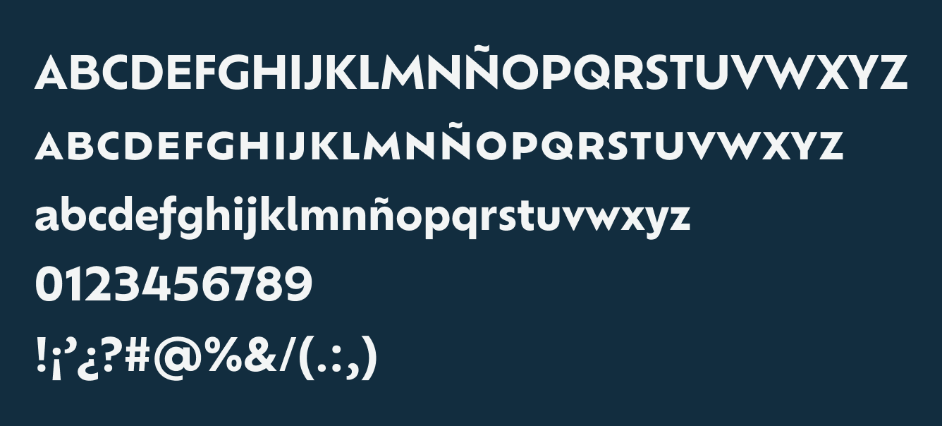
Swapps Typography
We use the Ofelia typeface for the consolidation of our visual identity. It is a versatile typeface that adapts to almost any situation thanks to the optical adjustments of its Display and Text versions.

Swapps Powered by
Powered by is the element that represents the design, creation and development of a product and by which we guarantee to fulfill all the expectations of our clients in the development of their projects.

Swapps UI Style Guide
A style guide developed to understand the correct use of graphic elements and components within the website.
