As front-end developers we usually need to align vertically any type of content, or to define a grid with equal-height columns, to say the least. Before CSS3, these kind of tasks were done in a hacky, unclear way and didn’t always worked well in all situations. Fortunately for us, CSS3 introduced a new feature to deal with elements of dynamic content and display them in a clear way that works in every case.
Flexbox allows us to distribute space for elements in a container based on several options, so we can align, change size, direction and even order of the elements as we like. Next, I will show you the main concepts of this layout.
Flex layout
The flex container is defined by the display: flex; rule, it can be any element and it gives flexbox properties to its children, which are called items. Containers and items have properties of their own, and rules defined for items can override the rules defined for the container. Flexbox works with two axes, the main axis (which follows a horizontal, left-to-right direction as default), and the cross axis (vertical, top-to-bottom direction as default). Of course, you can change the direction as you like. In the following image you can see the distinction between the flex container (blue border) and flex items (black border).
Container properties
As I previously said, we need to define the value of display in flex (or inline-flex) for the element acting as the container. Done that, we have access to the following properties:
flex-direction changes the direction, as mentioned earlier, of the main axis. Possible values for this are row, column, row-reverse and column-reverse. The row and column values act according to the main axis and the cross axis defaults, respectively. Using reverses will change the direction while staying in the same axis, and this applies for any property in which they are used.
flex-wrap allows us to stack items in multiple lines, instead of a single line which is the default behavior. The values we can use for this are no-wrap (default), wrap, and wrap-reverse. This last one will change the direction of new lines added.
justify-content defines the alignment along the main axis on current line. With this property we can reuse the space left (as in the first image above) and distribute it as we think conveniently. Values:
- flex-start: items are aligned in the origin (equivalent to aligning left in default direction). Default.
- flex-end: items are aligned at the end (equivalent to aligning right in default direction).
- center: all items are centered within the line.
- space-between: first item is aligned at the origin, last item at the end, and the remaining ones will be assigned an even amount of space between each of them.
- space-around: items will have an even amount of space around them
align-items defines the alignment around the cross axis on current line, it’s similar to justify-content. Values:
- flex-start: as in justify-content,
- flex-end: as in justify-content,
- center: as in justify-content,
- baseline: align the items according to their baselines (the line where text for each item begins),
- stretch: items will fill the space in container. Default.
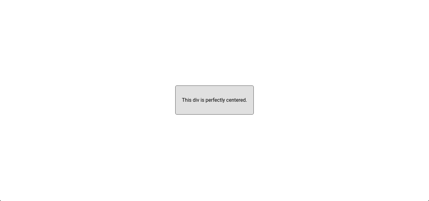
Here is a small use of justify-content and align-items together. You can vertically and horizontally align content just with two lines. Yes, that easy.
.container{
    display: flex;
    justify-content: center;
    align-items: center;
}
align-content behaves like justify-content, but takes the container as reference and works on multiple lines of items. Values:
- flex-start: as in justify-content, begins in the start of the container,
- flex-end: as in justify-content, begins in the end of the container,
- center: all lines of items go to the middle of container,
- space-between: distributes the remaining space of container between the lines as in justify-content,
- space-around: distributes the remaining space of container around the lines as in justify-content,
- stretch: lines take an even portion of remaining space and fill it. Default.
Items properties
order: Elements are rendered in source order by default, but this can be changed with this property. It can take any integer value, and elements are rendered according to their order value in an ascending way.
flex-grow indicates proportion, so an element with value set to 2 will take twice the size of an element with value of 1. The default value for flex-grow is 0 and it can take any positive integer value.
flex-shrink makes the item shrink if necessary, it receives a positive integer value and indicates proportion just like flex-grow. So, if an item has this property value set to 3, it will shrink three times more than the rest of item. The default value is 1.
flex-basis allows us to set the default size of an element before distributing the remaining space. The auto keyword will search for width or height property. It can take any length unit.
flex is a shorthand property for flex-grow, flex-shrink and flex-basis, in that order.
align-self behaves the same as align-items, but only modifies the alignment of the item where this property is specified. It can take the values of align-items.
Take note that the properties float, clear and vertical-align (oh really?) don’t work on a flex item. You don’t need them either, with flexbox you can distribute the space and items layout in the way you like.


