Como diseñadores y desarrolladores, debemos tener en cuenta a todas las personas que llegan a nuestras aplicaciones/sitios web, incluidas las personas con discapacidad visual. Nuestras creaciones deben ser, o al menos intentar ser, adecuadas para ellas, incluidas aquellas con una visión inferior a 20/20.
Es por eso que las Pautas de Accesibilidad al Contenido en la Web, WCAG fueron creadas, para ser un estándar en accesibilidad y proporcionar a las personas, organizaciones y gobiernos las herramientas para hacer que el contenido web sea más accesible.
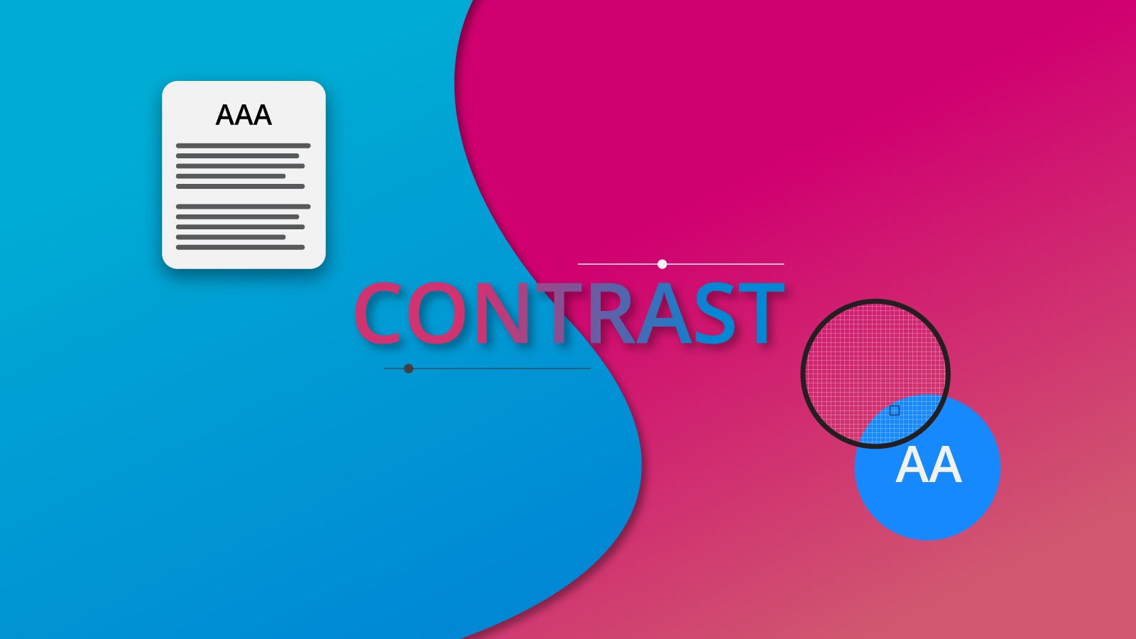
Veamos qué nos dicen los estándares de accesibilidad descritos en WCAG 2.0 en relación con el contraste, es decir, el color de primer plano y de fondo cuando se trata de texto.
Google Chrome browser added a new feature to its Web developer tool.
The last item shows the Contrast section.
PROPORCIÓN
WCAG determina el nivel de contraste de acuerdo con la ecuación DE Luminancia Relativa. En pocas palabras, la ecuación muestra un número entre 1 y 21, siendo 21 la mayor cantidad de contraste y 1 sin contraste. Por ejemplo, el texto blanco sobre fondo negro sería 21 en proporción, y el texto negro sobre fondo negro sería 1.
En la imagen de arriba, puede ver que diferentes textos sobre colores de fondo generan diferentes relaciones de contraste. Incluso puede observar un pequeño rectángulo con el color de fondo y el color del texto sobre él. El número de relación de contraste está al lado de esta pequeña vista previa. ¿Ves el símbolo menor que en las cifras de la relación de contraste? Le muestra que el número no alcanza el mínimo para aprobar como un puntaje válido. Veamos qué es la puntuación y cómo se relaciona con la relación de contraste.
PUNTUACIÓN
Entre 1 y 21 hay un espectro. Por lo tanto, se genera una puntuación al comparar el espectro del elemento dado que está volviendo a visitar. Estos son:
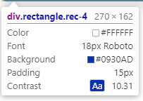
AAA
Means that your text has a contrast ratio of at least 7.0. For example, a f6f6f6 color text over a 0930ad generates a triple A score. (See image below).
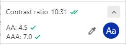
But consider something: section 1.4.8.1 of the WCAG states that: “Foreground and background colors can be selected by the user.”. So, an app/website would be AAA only if the user can change the background and foreground colors. My recommendation is that, unless you are planning to create a feature that allows the user to do exactly that, don’t worry too much for this type of score.
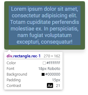
AA
This score means that your text has a contrast ratio of at least 4.5 or higher. This is the same score as AAA Large. In the previous image you can see that the color contrast enters on this score too. Why Large? Well, the WCAG describes 14pt bold and 18pt as “large sizes”. But this could be an approximation, since letterform sizes can vary between typefaces. For example, a 14pt size on a Lato typeface font could appear smaller than PlayFair Display typeface.
AA Large (AA+)
AA large means color contrast that reach at least 3.0 in contrast ratio. This score is derived from WCAG comparison for the minimum level recommended by ISO-9241–3 and ANSI-HFES-100–1988 for standard text and normal vision.
Remember, all of this scores and numbers are aimed to improve your design elements for your users. So, don’t overlook these guidelines.
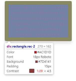
FAIL
This score means that your text has a contrast ratio of 2.9 or lower. Just consider that this numbers and guidelines does not apply to logos, text in logos and other decorative elements.
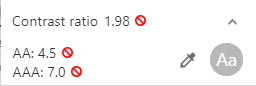
Unfortunately, this contrast ratio doesn’t reach the level to pass the test, so it fails.
So, in order to achieve the best experience for your users, you need to take into consideration these guidelines for your text and its contrast in your app/website. Although in this part we focused on text, there’s much more in the WCAG document. For example, in Visual Presentation:
(Level AAA)
For the visual presentation of blocks of text, a mechanism is available to achieve the following:
- Foreground and background colors can be selected by the user.
- Width is no more than 80 characters or glyphs (40 if CJK).
- Text is not justified (aligned to both the left and the right margins).
- Line spacing (leading) is at least space-and-a-half within paragraphs, and paragraph spacing is at least 1.5 times larger than the line spacing.
- Text can be resized without assistive technology up to 200 percent in a way that does not require the user to scroll horizontally to read a line of text on a full-screen window.
For instance, your app/website could have a AAA on text contrast, but if you don’t allow your users to select foreground and background colors, your product simply doesn’t fit that score.
These guidelines could be very complicated to achieve at first glance, and maybe some parts of them will be strange, but with practice you can reach your goal: make your User Interface accessible for everyone in the world.