Buttons
Buttons are interactive elements that allow users to perform actions or navigate through an interface. They are essential for guiding user interactions and enhancing the overall user experience.

Best Practices
Do´s:
- Provide clear labels: Use concise and action-oriented text like "Submit," "Cancel," or "Delete."
- Use consistent spacing: Maintain consistent margins and paddings around buttons to ensure a clean layout.
- Maintain accessibility: Ensure buttons have sufficient contrast ratios and include accessible labels for screen readers.

Dont´s:
- Use vague labels: Avoid labels that are not clear or descriptive, like "Click here" or "Go."
- Neglect state changes: Ensure that buttons visually respond to user interactions, such as hover and active states.
- Ignore context: Avoid placing buttons in locations that may confuse the user or interrupt their workflow.

Variants

| Variants | Usage |
|---|---|
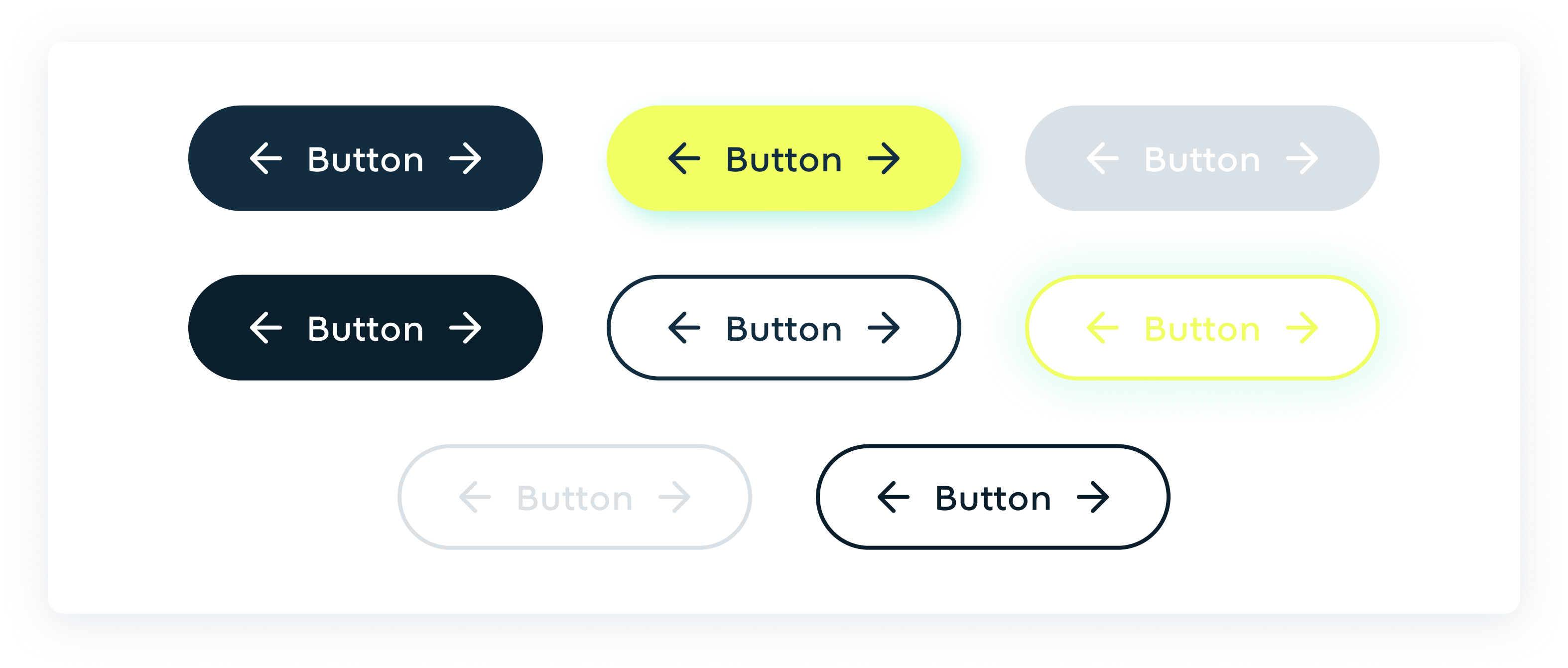
| Default | The default state of a button represents its appearance when it is not being interacted with. This is the standard look of the button as it appears on the page. |
| Hovered | The hovered state of a button indicates that the user's pointer is hovering over it. This state provides visual feedback that the button is interactive. |
| Disable | The disabled state indicates that the button is not currently interactive. This is typically used when the button action is not available. |
| Clicked | The clicked or active state represents the button when it is being pressed or activated. This provides feedback that the button has been clicked. |